
BRAND REDESIGN
I was approached by 3iQ to do a company-wide rebrand. The investment firm manages cryptocurrency assets for a variety of clientele. The goal was to create a bold, universal design to engage clients across generations.
Inspired by building blocks, pop art, and retro-futurism, I came up with the design for "Retro-Tech".
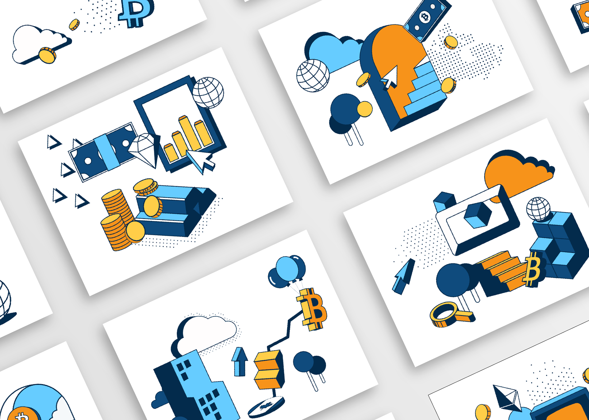
Flat icons lie on a dimensional grid to create a 2D, yet imaginative space. Framed by thick lines and bold colors, the icons of technology past (microcomputers, boxy cursors) become sleek and the icons of the future (Bitcoin, wifi) become familiar. The result is an approachable design that has the ability to adapt to any screen.

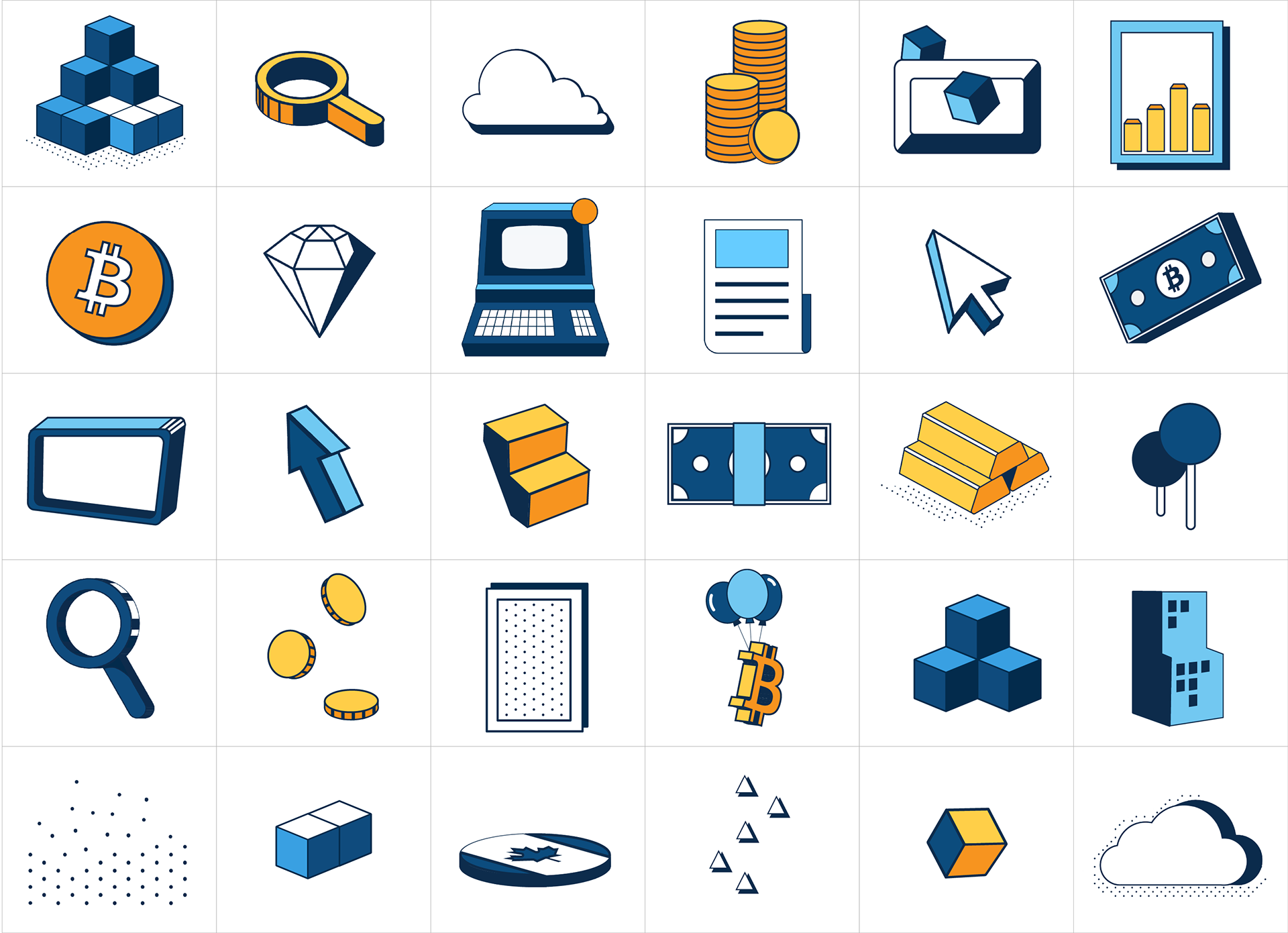
Illustrated 80+ assets for a custom graphic library
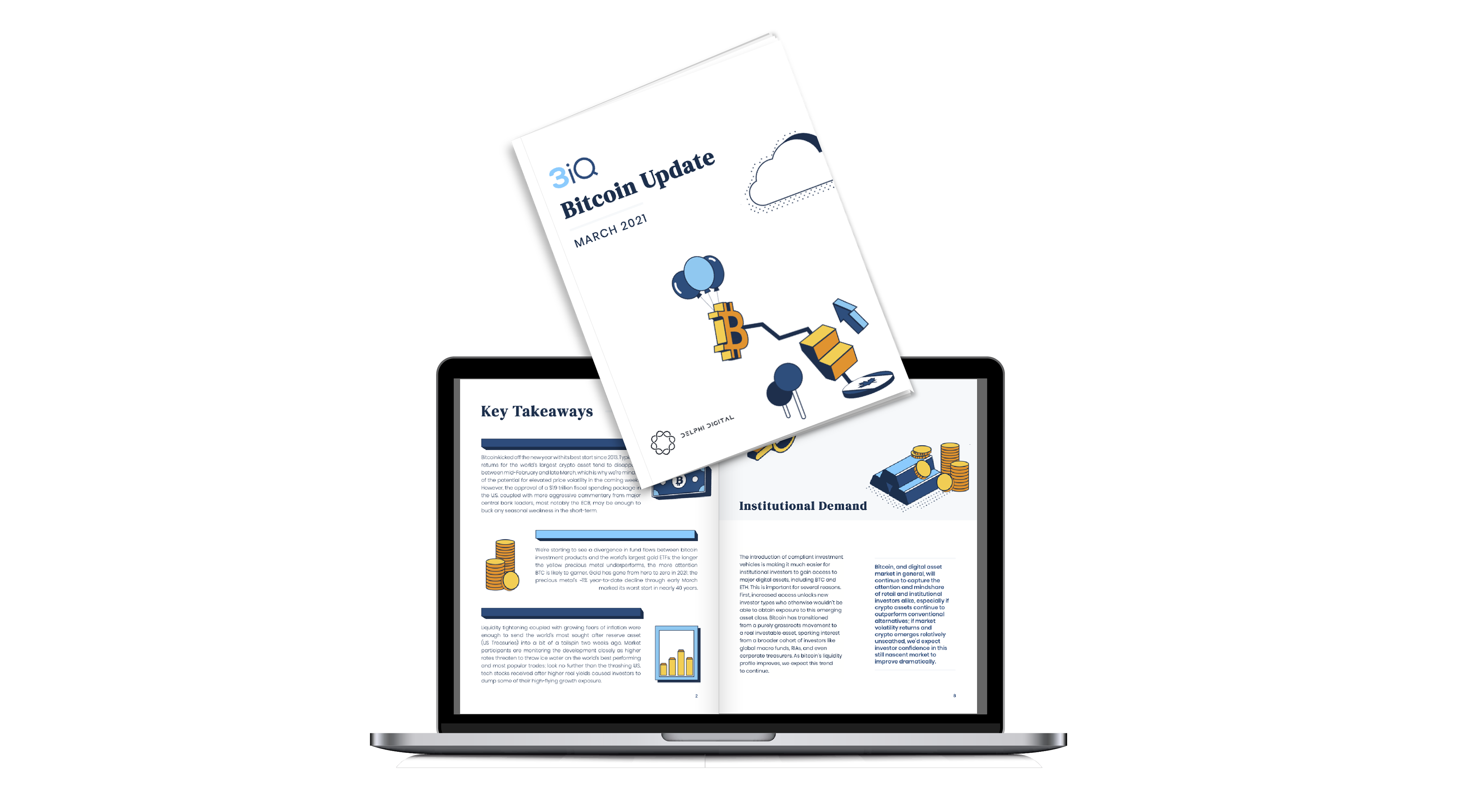
Monthly fund report designed for print and web
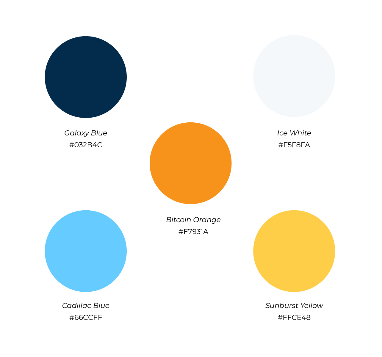
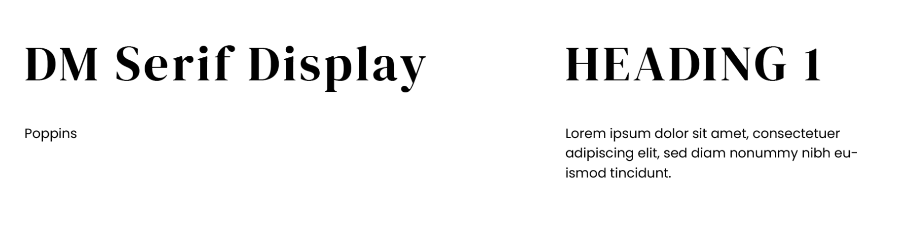
The color palette and typography selection were chosen to align with the brand identity. While color choices are standard blue for tech, warmer colors are used as accents to add a modern feel. Proud serif headings are accompanied by readable sans-serif body text. The typography follows the "golden rule" of type and bridges the gap between an age-diverse client base.
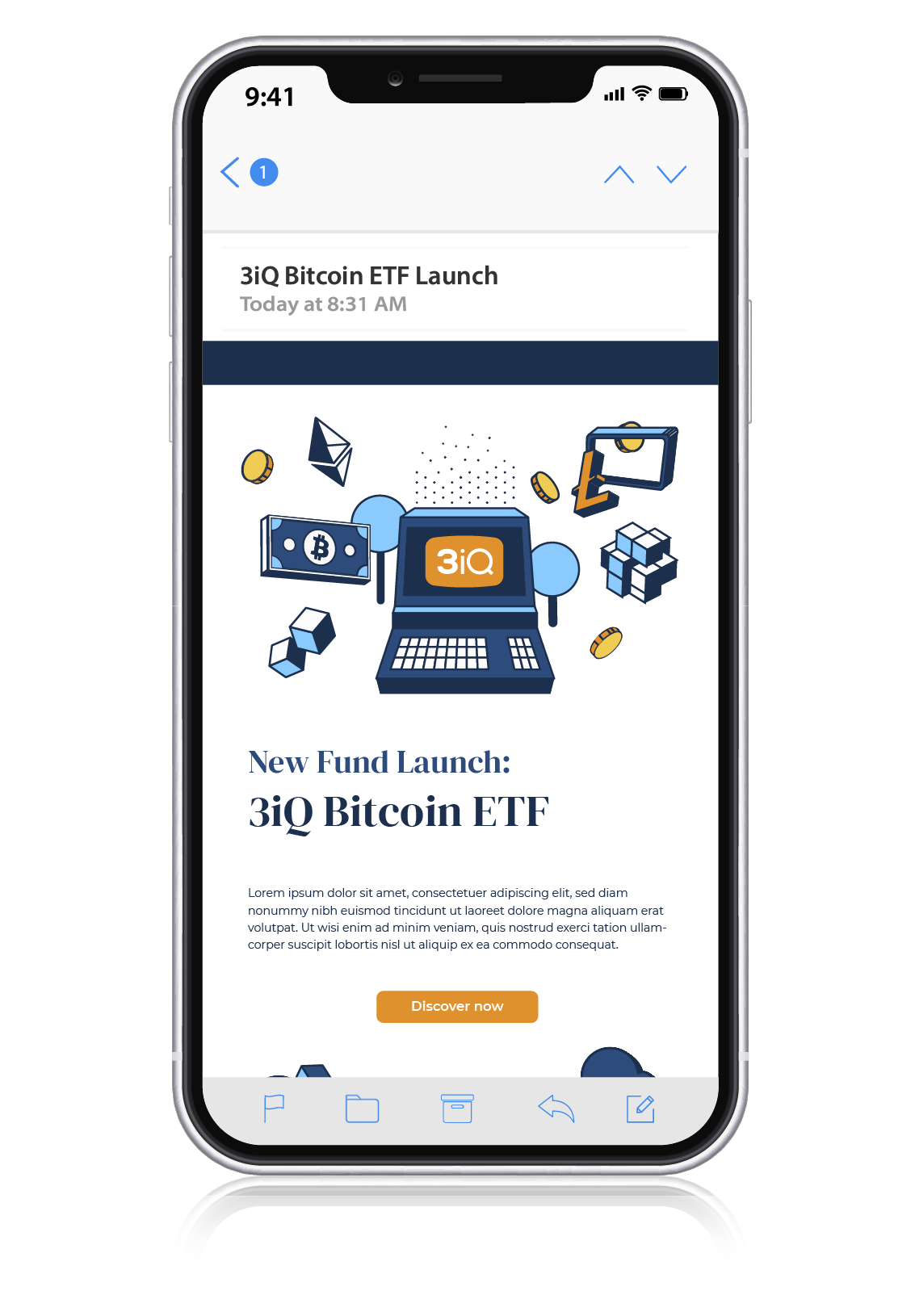
Provided a custom code for email templates that allows for a responsive layout and customizable design elements
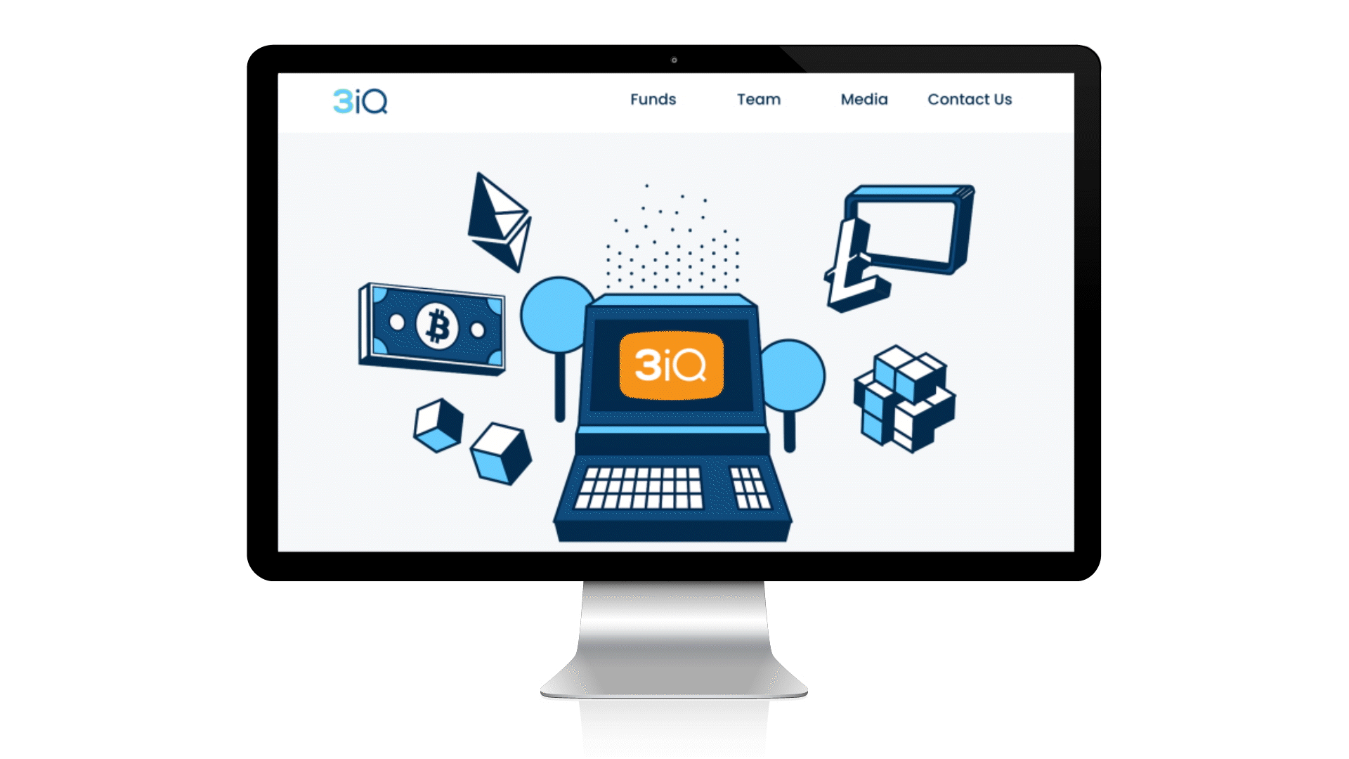
Mockup for homepage design
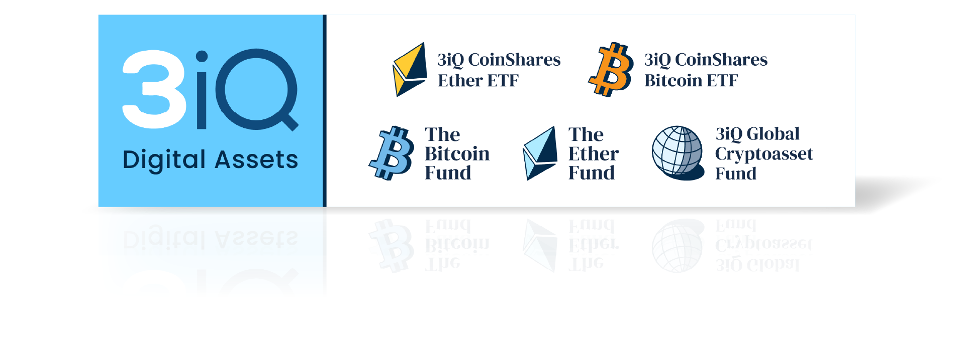
Each of the six funds required its own logo that adhered to branding while differentiating itself from similar funds
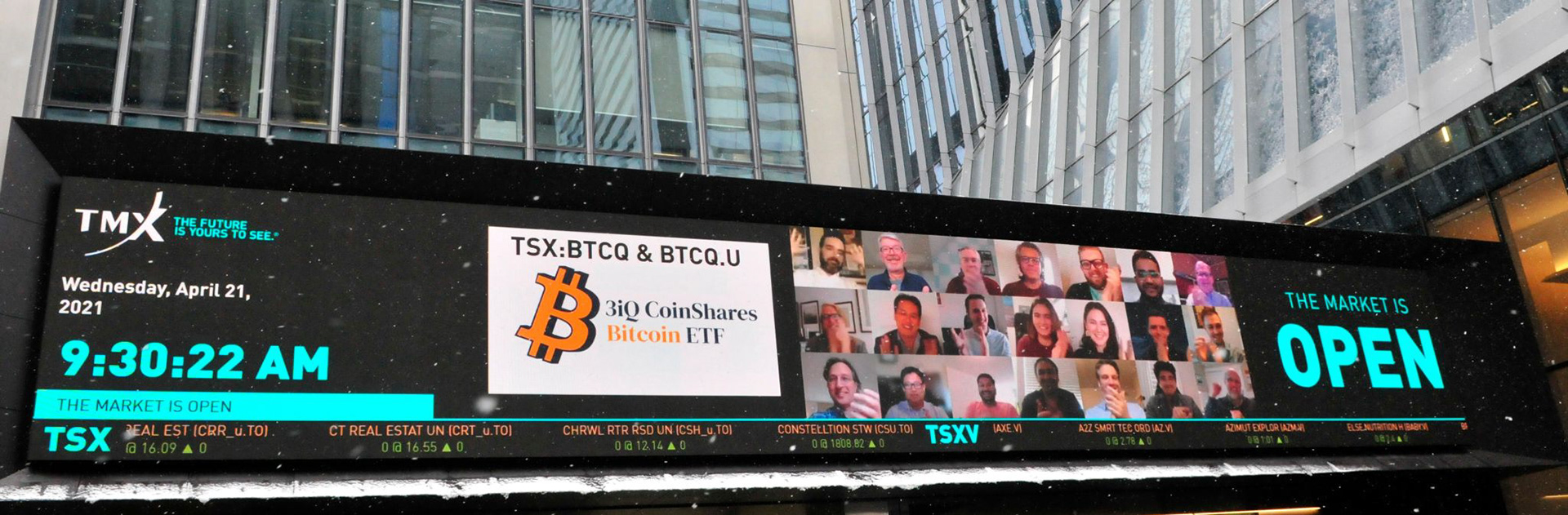
Billboard launch with new Bitcoin ETF logo
Other projects include...
Creating design assets for the Dubai company branch

-